
This month our challenger was the very talented Audrey Yeager. Audrey noticed (as you may have too) that all but one of our members is a single page designer. Our default design is a single 12x12 design! That's why we love IE..so many styles and we all approach it differently! In fact, we have invited a valued guest designer to join us this month; her name is Scarlett Salamone.
Here's a bit of what Audrey had to say in her challenge this month. She even gives us a few tips and a link to a great blog for inspiration!
" I take a lot of photos. Right now, I have been using 2 or 3 smaller
photos on my layouts. But truth is, I
have a lot of events where I would like to include a lot of photos on a larger
spread so that you can see the details in the photos to. So I print out the photos with the intention
of putting them on a 2-page spread...
I just can’t get it. I feel like I have a certain style, yet when
I sit down to create a 2 pager, it feels nothing like “me”.
SOOOO, your next challenge is to create a
double page layout. And I don’t mean
just any double page. I want you to
really think about your style and your design practices for single pagers (the
first assignment helped us define our style, so think about those
elements). Then take those ideas and try
to apply them to a double pager.
Here
are some ideas:
*Start by thinking of your canvas as a
12x24” size. Before you even print
photos or pick papers, try to envision (or sketch out) a design that feels like
“you”.
*Once you have a basic design, think about
the techniques that you love and where/how you will incorporate them on your
page.
*Choose products that you would use for a
single page layout. If you use white
cardstock as a base a lot of times, then use it on your double page. If you mostly use patterned paper, then use
that. And if you don’t have 2 of the
same sheets of patterned paper for your background, I REALLY challenge you to
use 2 different 12x12 sheets for the base of your spread! (Kim Watson does a superb job of using 2
different sheets for her backgrounds…if you have CK magazine, look at some of
her pages.) http://kj-starre.blogspot.com/
*Another way to approach this, (which I
personally want to experiment with more), is to create 2 single pagers, but use
the same papers in the same ratios. The
papers and the photos will help tie your design together.
You might do this challenge and not be
happy with your first result, so I challenge you to KEEP TRYING! Do a 2nd , double page layout and
try to learn from your “mistakes” on the first one.
Also, if you typically DO create 2 pagers,
then apply the same ideas to a single page spread instead.
As we create this month, if you have
thoughts about your process or are struggling, OR you are loving what you are
creating, share some of your ideas with us!!!
I can’t wait to see what you create!"
Okay, you all know that I never, I mean NEVER create two page layouts. I am just not good at them, I can never make them flow or look like my style! Even when I had the store and did layout classes, I created coordinating layouts that customers could do one or two page layouts by using collections packs and card stock. So this was a challenge for me, I struggled with it and then struggled some more. I muddled my way through it..determined to create something that felt like me. I had these wonderful photos that Rosie shared with me and I just wanted to do them justice. They are just too cute and the pictures share such a precious moment!
Two pagers really don't fit on the blog, so if you click on it, you should be able to see it up close! So here it goes:
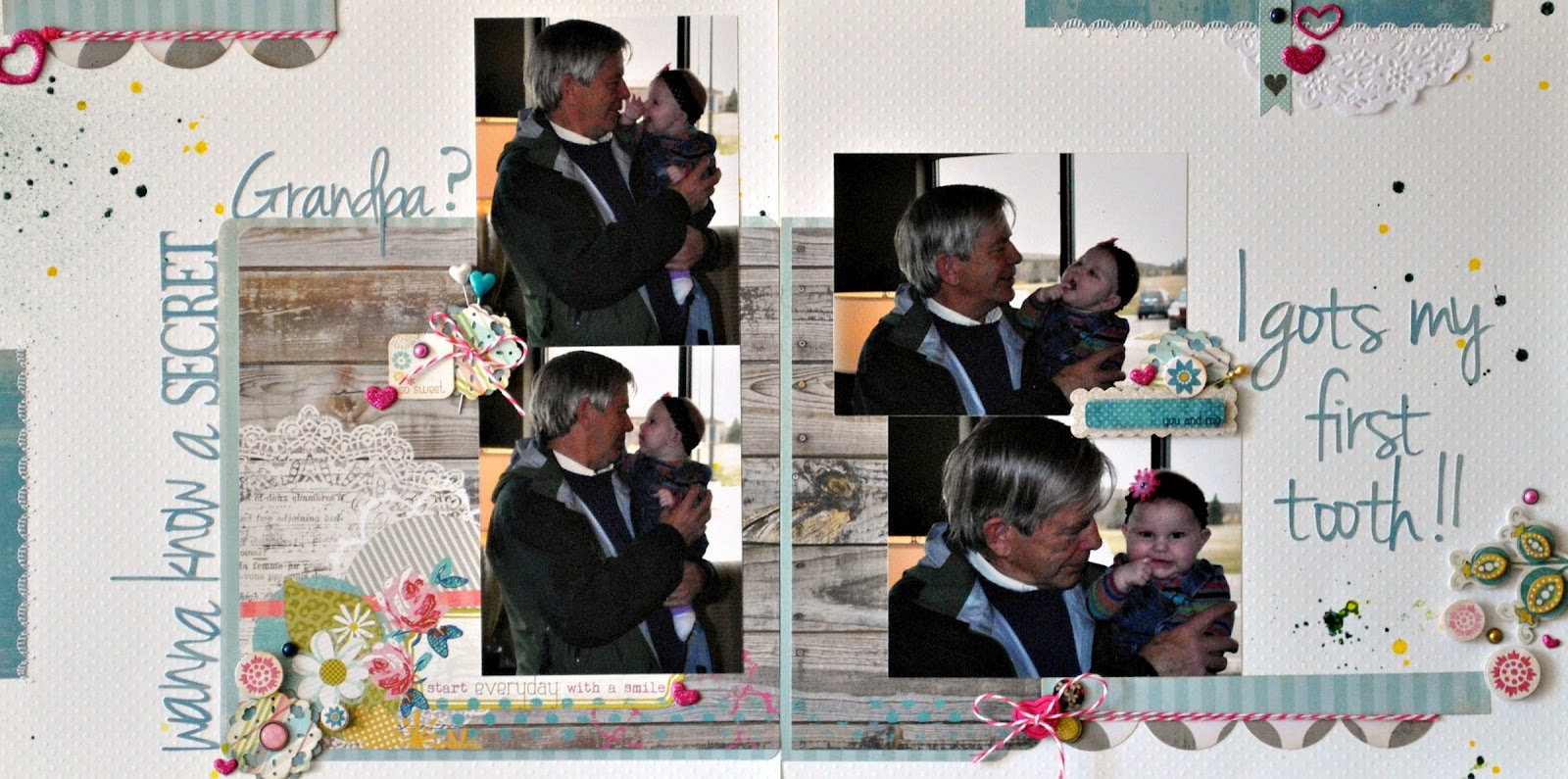


What makes it "my style"?
Bazzill Swiss Dot Card stock (love it)
Studio Calico Mister Hueys
My Mind's Eye Papers
A bit of open space,a bit of sewing, some bling and twine!
Do I love it?..not so much..but I am okay with it. I might even try my hand at a couple more two pagers...might being the key word. I enjoyed the challenge and I am a bit worried about what Audrey's next challenge for us might be..lol!
Take a peek at what this amazing team has created!
Cathy Harper (you are here)
Scarlett Salamone - July Guest Designer
I invite you to play along with any of our challenges. You can see the first two challenges: #1 is here and #2 is here. We would love to see what you are inspired to create. Add your comment below with a link, I will be sure to drop by and say hello.

12 comments :
Well Cathy, you might not love it... but I do! You did an awesome job with your double-page and all the little details that make it you!
Joanne xo
Oh girl, you should love it, it's amazing! Love your doilies and misting!
I love it too!! So much greatness! That split title, the clustering, the wood grain and how you split the papers. Plus all that great splatter and confetti. It's great!
This is fabulous, love the misting and the clusters!
Well I love it! It is just too precious. Loving the super long title and all of the pretty bits and bobs sprinkled around your page!
I really love how you did your title! The mme papers have my heart and love all the details of misting too!!
Cathy, It's awesome. I know it's hard for you think "two pages are one" but you did it. You really did. It's FAB, Darhling. Also, I love love love the little flowers at the far left of your "canvas." Whos are they, and, they look like chipboard, are they, or are they just awesome c/s ones you popped up. Keep rockin' it. Ciao.
You under estimate yourself! This is FABULOUS!
Ditto for me...Fabulous page.
You've done a terrific job of creating flow across the two pages! The title work is fabulous and the photos so sweet!
Aww, the title for these pages is adorable as are the photos!! Love all the little details you added.
I love it too! Great photos and the misting is perfect!!
Post a Comment